
2026
Qatar Licensing Platform
Designed the experience for a multi-entity licensing platform: the apply-and-upload, status tracking, and result flows, plus how documents and approvals behave across three separate authorities.
Investment Platform
Website Design
UI/UX Design
Know More
Opening a company in Qatar means clearing approvals from three separate government bodies, each reviewing its own documents on its own timeline. MOCI, the Ministry of Interior, and the Municipality all work independently of one another. The brief was to make that fragmented process feel like one for the investor.
The screens were never the hard part of this. The real product was the logic underneath: how documents and approvals behave when three authorities act in parallel. I designed for state first and layout second.
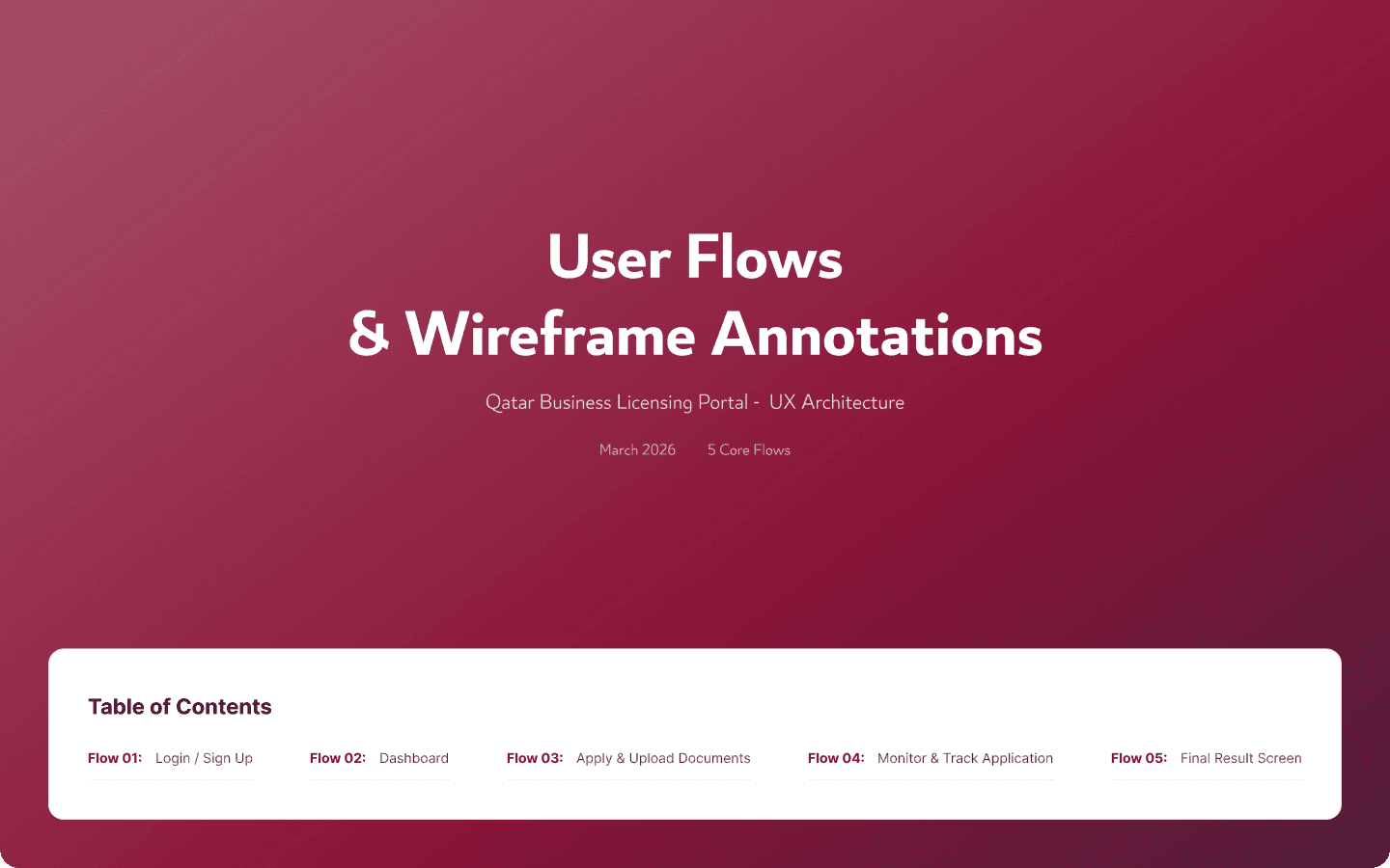
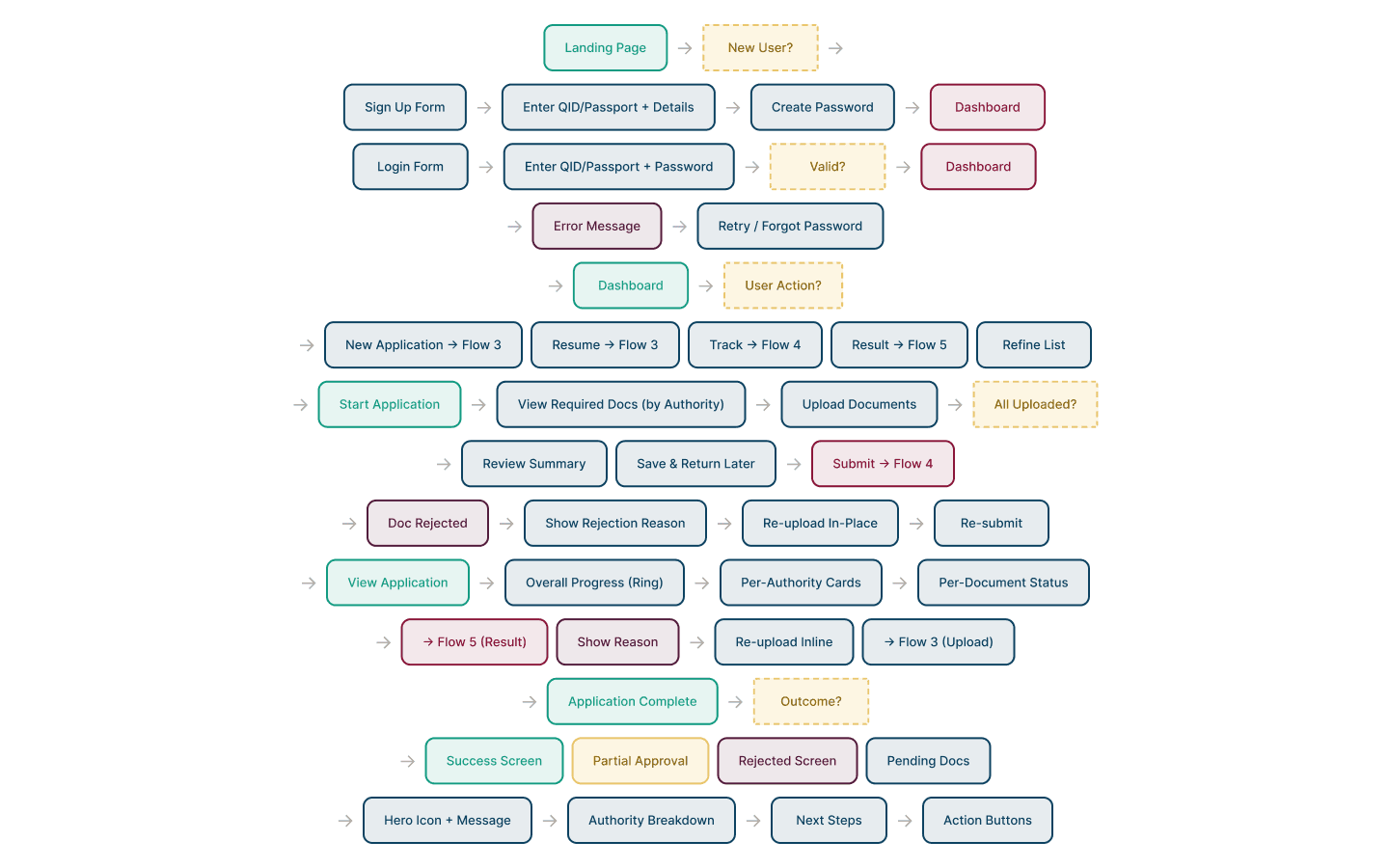
I focused on the three flows that carry the whole experience: applying and uploading, tracking progress, and reaching a result. Each had to stay clear no matter how messy the underlying approvals got.
The Hard Part
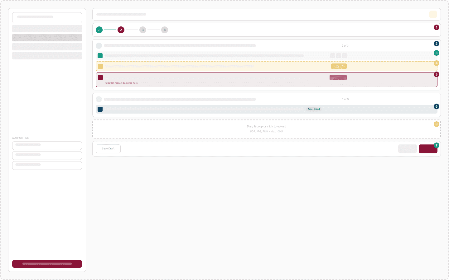
Each authority reviews its own documents independently, so at any moment the application is a patchwork. MOCI might be approved while the Municipality is blocked on a missing lease. A single document can be rejected by one body, with a reason, while everything else moves on.
Each authority reviews its own documents independently, so at any moment the application is a patchwork. MOCI might be approved while the Municipality is blocked on a missing lease. A single document can be rejected by one body, with a reason, while everything else moves on. Designed naively, that complexity lands on the investor as anxiety: which of my documents is the problem, and who do I chase. The job was to absorb it rather than forward it on.

What I Did
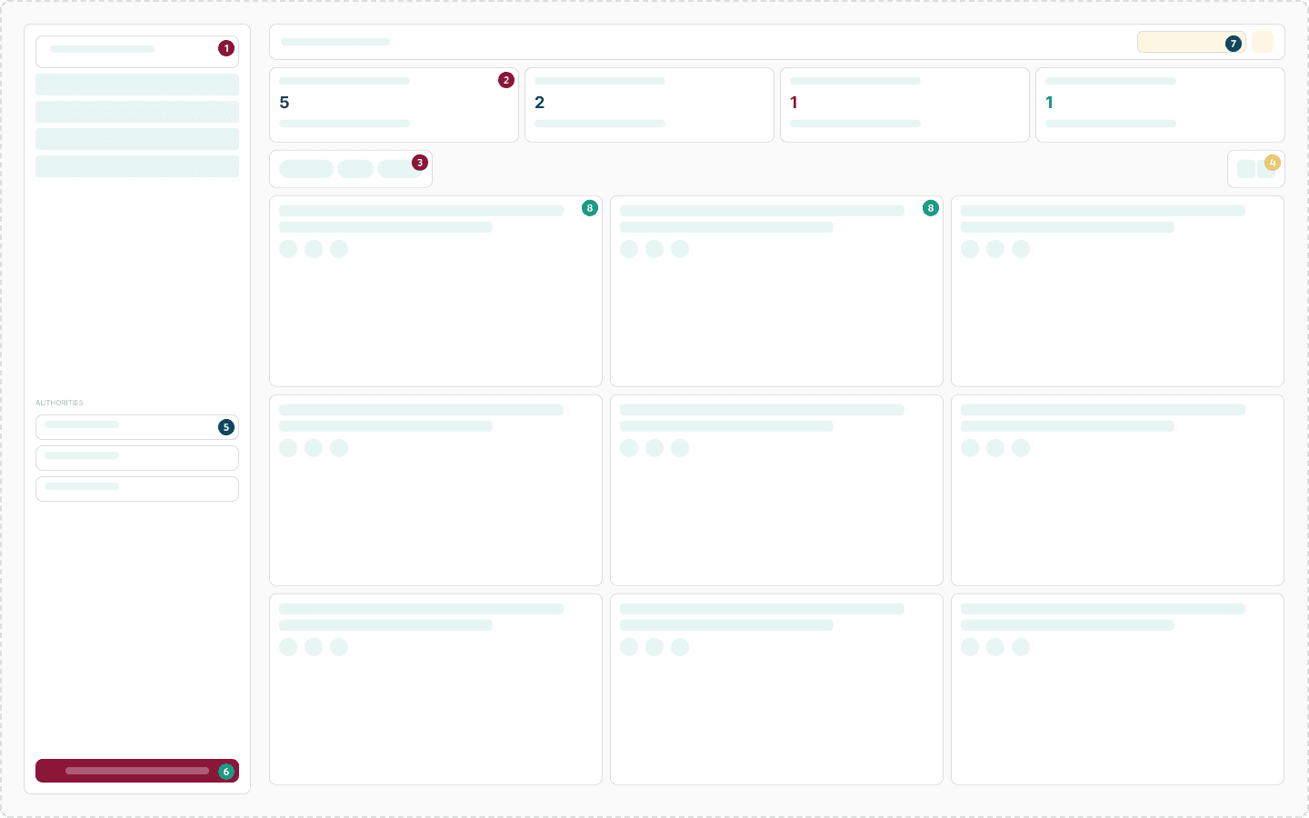
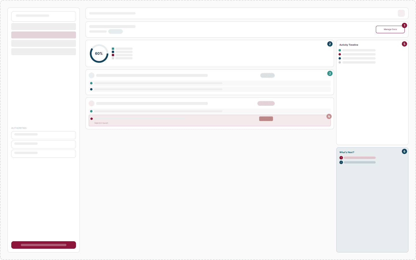
I grouped required documents by authority, so the structure mirrors how approvals actually work. Rejected items come back with the reason and a clear path to reupload. The tracking view rolls everything up, then breaks it down by authority and by document.
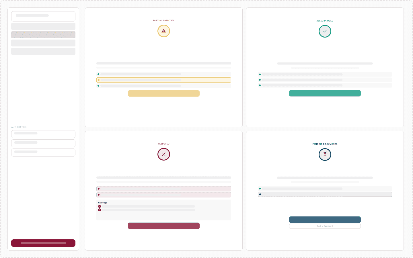
The result screens cover every real outcome: all approved, partial approval, rejection, and pending documents. Each one states the overall status, the authority-by-authority breakdown, and the next step to take.
What Changed
The investor always knows three things: the overall status, the detail by authority and document, and the single next action. Five document states and three parallel tracks sit behind that. The complexity lives in the structure, not on the user.
Partial approvals and single-authority rejections read clearly rather than as a confusing mess. As a concept, it shows how a truly multi-entity process can still feel like one journey.
The Call
The tempting move was to flatten everything into one progress bar. But the approvals really are independent, and that pretence breaks the moment one authority rejects a document. I kept the three-authority structure visible where it helps the investor act.
Everywhere it would only add noise, I absorbed it into the structure. The process feels like one journey without lying about how it works underneath.
More Works


FAQ
01
Are you available?
02
Full-time, freelance, or both?
03
What kind of work do you take?
04
Remote, on-site, or both?
05
Bilingual?
06
What do I need to get started?
07
What about unpublished or NDA work?
08
How long does an engagement take?
2026
Qatar Licensing Platform
Designed the experience for a multi-entity licensing platform: the apply-and-upload, status tracking, and result flows, plus how documents and approvals behave across three separate authorities.
Investment Platform
Website Design
UI/UX Design
Know More
Opening a company in Qatar means clearing approvals from three separate government bodies, each reviewing its own documents on its own timeline. MOCI, the Ministry of Interior, and the Municipality all work independently of one another. The brief was to make that fragmented process feel like one for the investor.
The screens were never the hard part of this. The real product was the logic underneath: how documents and approvals behave when three authorities act in parallel. I designed for state first and layout second.
I focused on the three flows that carry the whole experience: applying and uploading, tracking progress, and reaching a result. Each had to stay clear no matter how messy the underlying approvals got.
The Hard Part
Each authority reviews its own documents independently, so at any moment the application is a patchwork. MOCI might be approved while the Municipality is blocked on a missing lease. A single document can be rejected by one body, with a reason, while everything else moves on.
Each authority reviews its own documents independently, so at any moment the application is a patchwork. MOCI might be approved while the Municipality is blocked on a missing lease. A single document can be rejected by one body, with a reason, while everything else moves on. Designed naively, that complexity lands on the investor as anxiety: which of my documents is the problem, and who do I chase. The job was to absorb it rather than forward it on.
What I Did
I grouped required documents by authority, so the structure mirrors how approvals actually work. Rejected items come back with the reason and a clear path to reupload. The tracking view rolls everything up, then breaks it down by authority and by document.
The result screens cover every real outcome: all approved, partial approval, rejection, and pending documents. Each one states the overall status, the authority-by-authority breakdown, and the next step to take.
What Changed
The investor always knows three things: the overall status, the detail by authority and document, and the single next action. Five document states and three parallel tracks sit behind that. The complexity lives in the structure, not on the user.
Partial approvals and single-authority rejections read clearly rather than as a confusing mess. As a concept, it shows how a truly multi-entity process can still feel like one journey.
The Call
The tempting move was to flatten everything into one progress bar. But the approvals really are independent, and that pretence breaks the moment one authority rejects a document. I kept the three-authority structure visible where it helps the investor act.
Everywhere it would only add noise, I absorbed it into the structure. The process feels like one journey without lying about how it works underneath.
More Works
FAQ
01
Are you available?
02
Full-time, freelance, or both?
03
What kind of work do you take?
04
Remote, on-site, or both?
05
Bilingual?
06
What do I need to get started?
07
What about unpublished or NDA work?
08
How long does an engagement take?
2026
Qatar Licensing Platform
Designed the experience for a multi-entity licensing platform: the apply-and-upload, status tracking, and result flows, plus how documents and approvals behave across three separate authorities.
Investment Platform
Website Design
UI/UX Design
Know More
Opening a company in Qatar means clearing approvals from three separate government bodies, each reviewing its own documents on its own timeline. MOCI, the Ministry of Interior, and the Municipality all work independently of one another. The brief was to make that fragmented process feel like one for the investor.
The screens were never the hard part of this. The real product was the logic underneath: how documents and approvals behave when three authorities act in parallel. I designed for state first and layout second.
I focused on the three flows that carry the whole experience: applying and uploading, tracking progress, and reaching a result. Each had to stay clear no matter how messy the underlying approvals got.
The Hard Part
Each authority reviews its own documents independently, so at any moment the application is a patchwork. MOCI might be approved while the Municipality is blocked on a missing lease. A single document can be rejected by one body, with a reason, while everything else moves on.
Each authority reviews its own documents independently, so at any moment the application is a patchwork. MOCI might be approved while the Municipality is blocked on a missing lease. A single document can be rejected by one body, with a reason, while everything else moves on. Designed naively, that complexity lands on the investor as anxiety: which of my documents is the problem, and who do I chase. The job was to absorb it rather than forward it on.
What I Did
I grouped required documents by authority, so the structure mirrors how approvals actually work. Rejected items come back with the reason and a clear path to reupload. The tracking view rolls everything up, then breaks it down by authority and by document.
The result screens cover every real outcome: all approved, partial approval, rejection, and pending documents. Each one states the overall status, the authority-by-authority breakdown, and the next step to take.
What Changed
The investor always knows three things: the overall status, the detail by authority and document, and the single next action. Five document states and three parallel tracks sit behind that. The complexity lives in the structure, not on the user.
Partial approvals and single-authority rejections read clearly rather than as a confusing mess. As a concept, it shows how a truly multi-entity process can still feel like one journey.
The Call
The tempting move was to flatten everything into one progress bar. But the approvals really are independent, and that pretence breaks the moment one authority rejects a document. I kept the three-authority structure visible where it helps the investor act.
Everywhere it would only add noise, I absorbed it into the structure. The process feels like one journey without lying about how it works underneath.
More Works
FAQ
Are you available?
Full-time, freelance, or both?
What kind of work do you take?
Remote, on-site, or both?
Bilingual?
What do I need to get started?
What about unpublished or NDA work?
How long does an engagement take?