
2024
SafeSpace Website - v.2
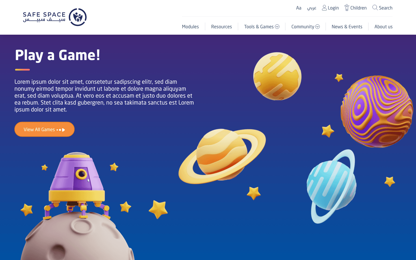
Designed a ground-up concept for SafeSpace, rethinking the structure, tone, and interaction from scratch.
Cyber Safety & Public Awareness
Website Design
UI/UX Design
Know More
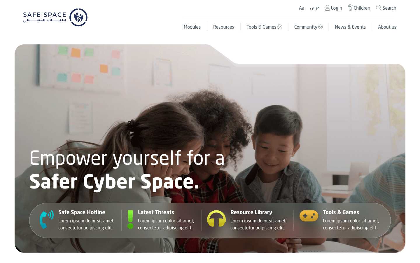
This was a clean-slate concept for SafeSpace, not an enhancement of what existed. Cyber safety is not theoretical; it runs into fear, uncertainty, and real consequences. A new platform had to feel supportive and trustworthy while handling difficult subject matter with care.
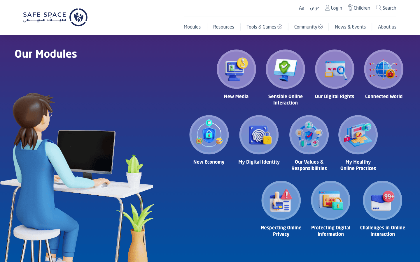
I designed a foundation that could carry education, prevention, and action without overwhelming anyone. The structure was built around emotional state as much as information. Depth, handled with care.
Hierarchy, tone, and flow were aligned to bring anxiety down and guide understanding. The aim was a platform that reassures before it informs.
The Hard Part
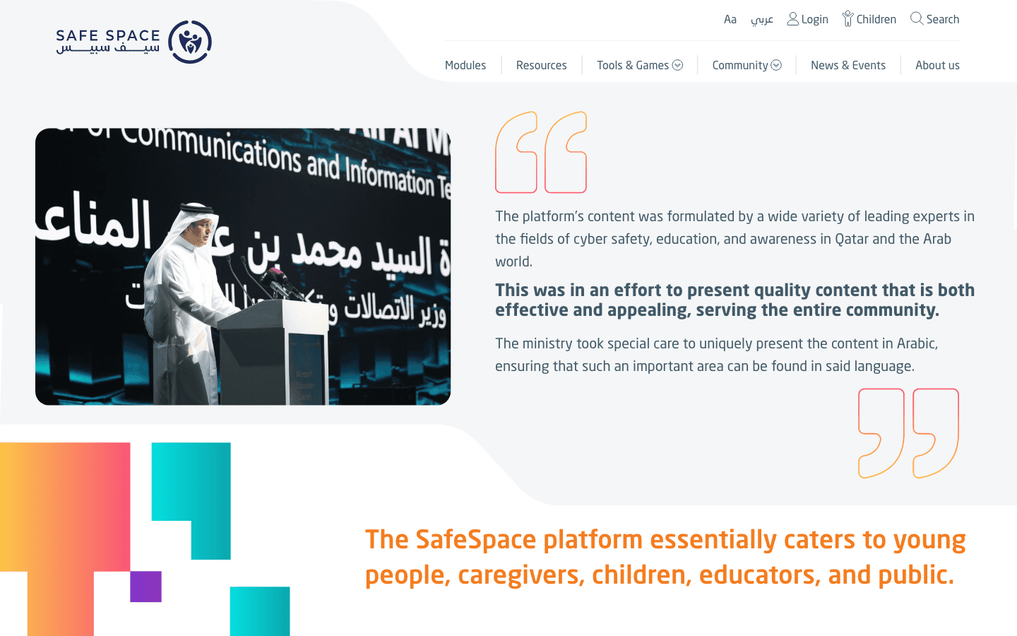
Building new in this domain carries its own risks. People struggle to know where to start, and dense content overloads them fast. Abrupt prompts to act erode trust at the worst possible moment.
Different audiences need different ways in, and the absence of a calm structure undermines confidence when it is most fragile. The concept had to plan for the worst day, not the average one.
What I Did
Different audiences need different ways in, and the absence of a calm structure undermines confidence when it is most fragile. The concept had to plan for the worst day, not the average one.
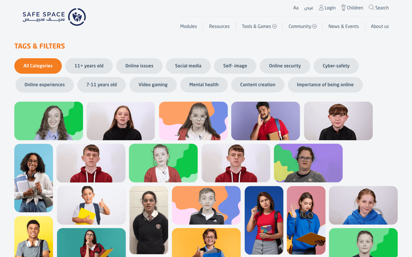
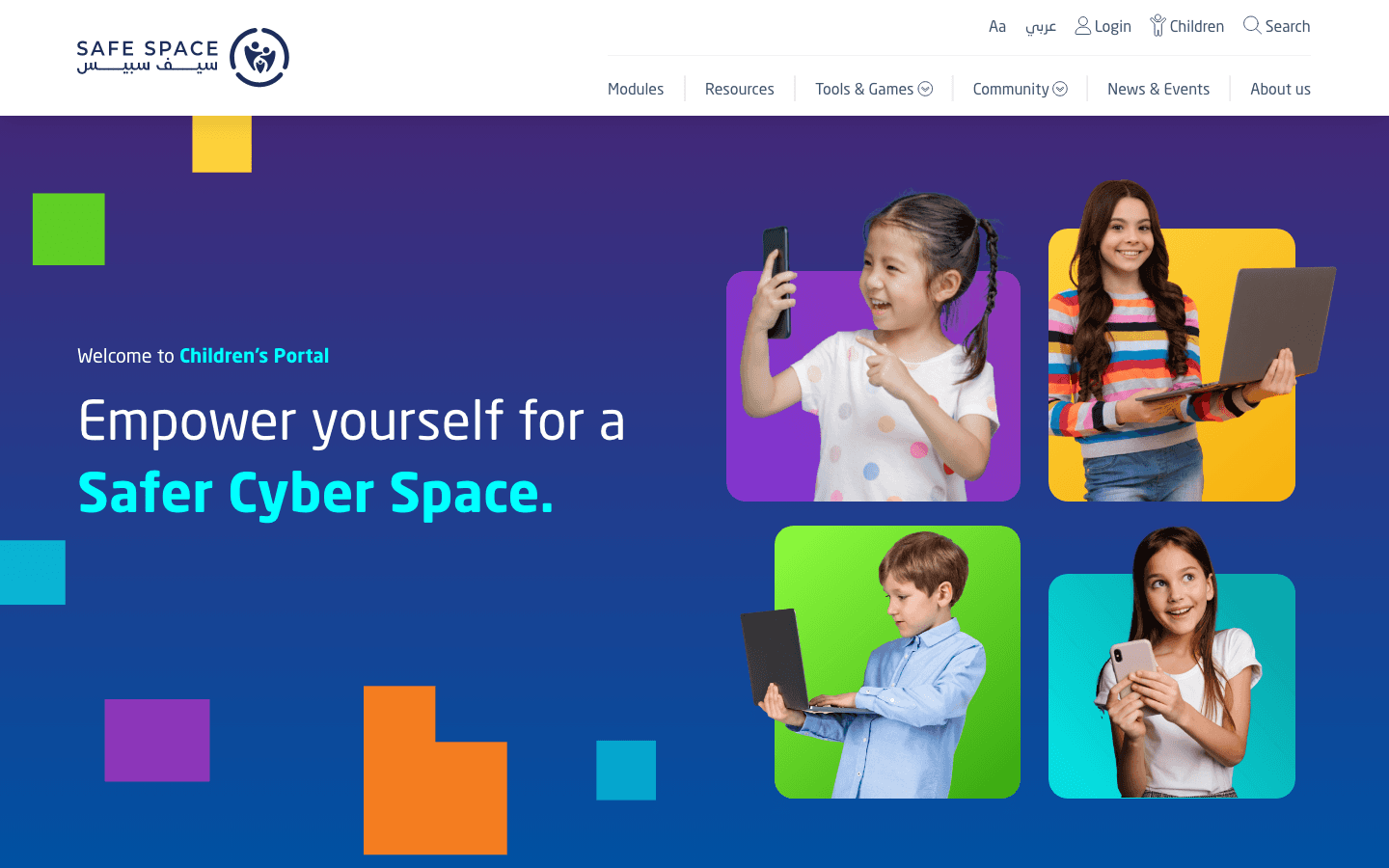
The visual language leans on calm spacing and readability throughout. A frightened first-time visitor is reassured before being asked to take anything in.
What Changed
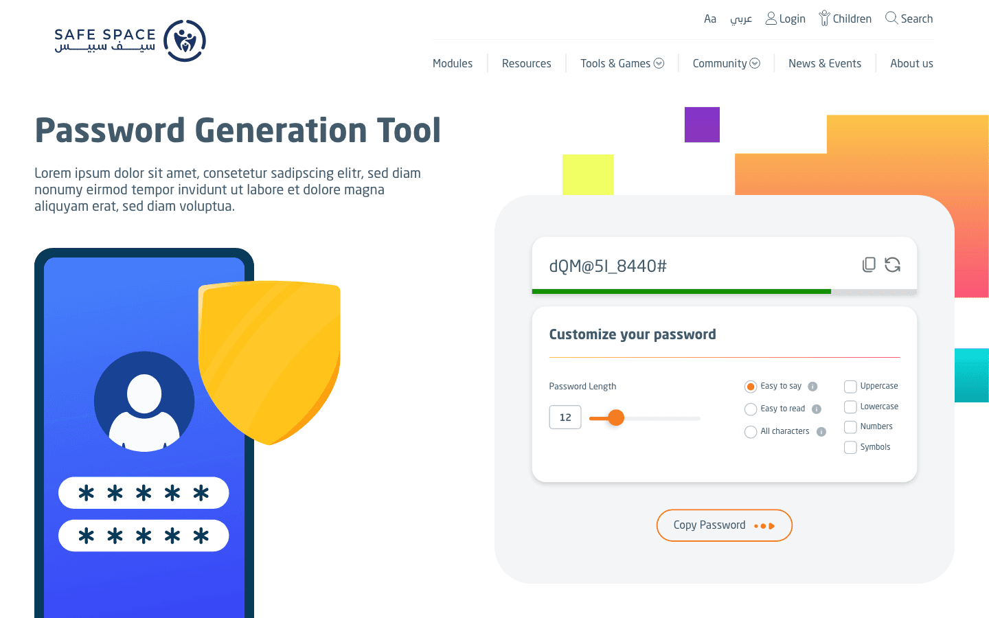
The structure itself carries the empathy the subject demands. People can act with confidence in moments that rarely allow careful reading. It set a clear direction for a calmer, more supportive SafeSpace.
Tone and layout reassure together rather than competing. The calm is designed in, not added on top.
The Call
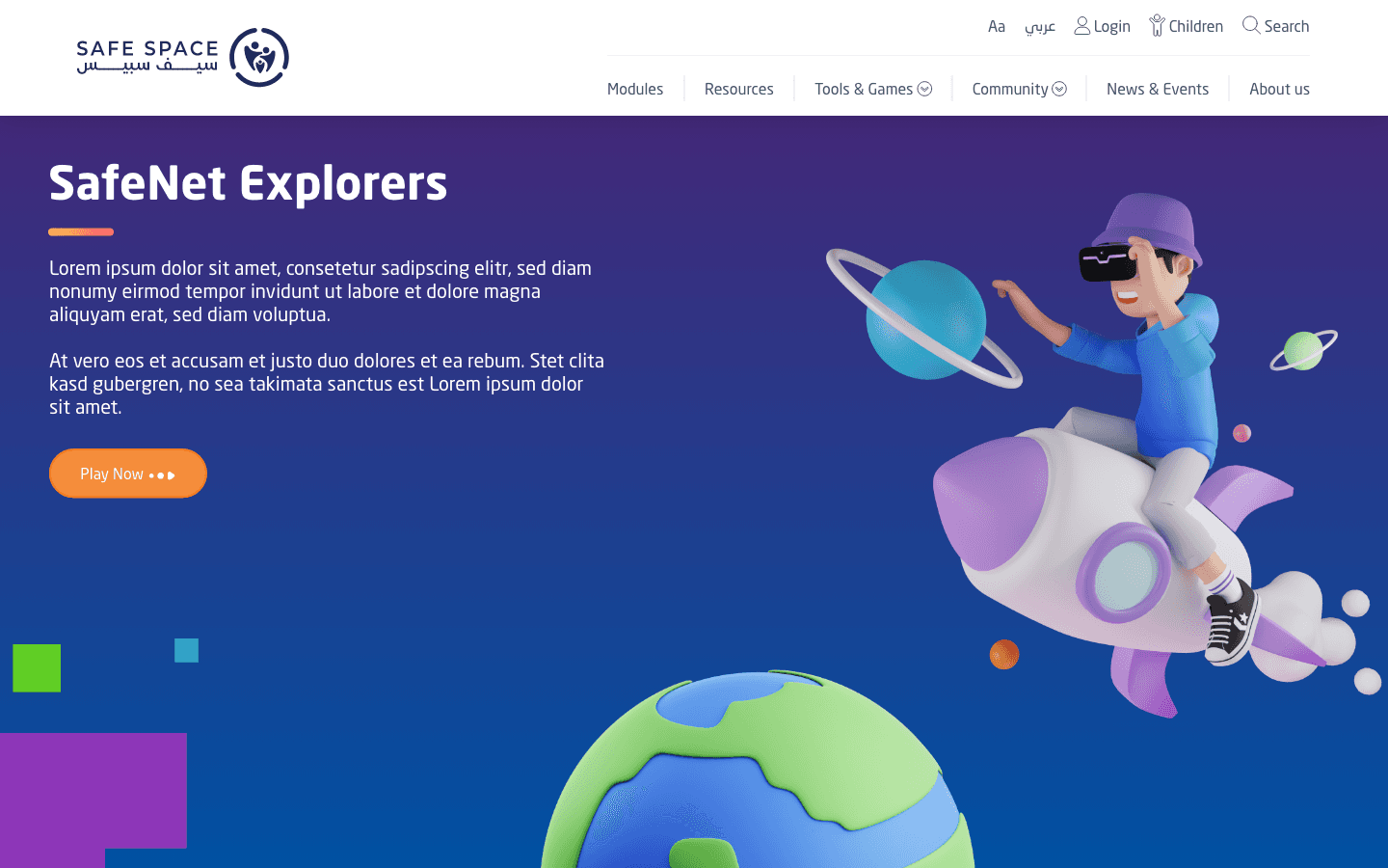
A safety platform can default to urgency, treating every screen as an emergency. I judged that constant alarm exhausts people and erodes trust. The concept leads with steadiness instead, and earns the right to prompt action.
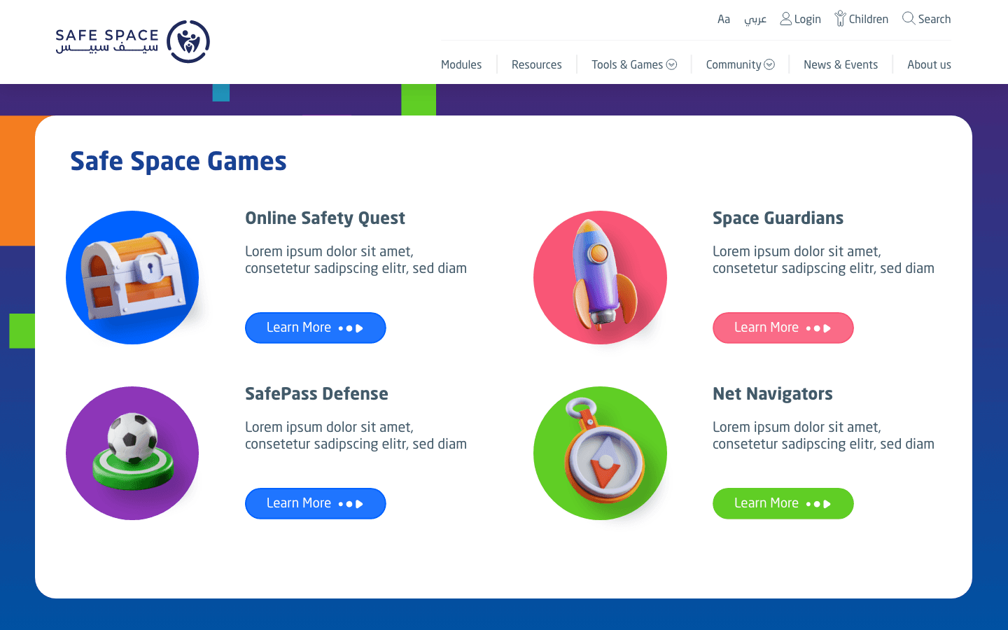
Calm was a deliberate stance, not an aesthetic. People who feel safe are the ones who actually engage and act.
More Works

FAQ
01
Are you available?
02
Full-time, freelance, or both?
03
What kind of work do you take?
04
Remote, on-site, or both?
05
Bilingual?
06
What do I need to get started?
07
What about unpublished or NDA work?
08
How long does an engagement take?
2024
SafeSpace Website - v.2
Designed a ground-up concept for SafeSpace, rethinking the structure, tone, and interaction from scratch.
Cyber Safety & Public Awareness
Website Design
UI/UX Design
Know More
This was a clean-slate concept for SafeSpace, not an enhancement of what existed. Cyber safety is not theoretical; it runs into fear, uncertainty, and real consequences. A new platform had to feel supportive and trustworthy while handling difficult subject matter with care.
I designed a foundation that could carry education, prevention, and action without overwhelming anyone. The structure was built around emotional state as much as information. Depth, handled with care.
Hierarchy, tone, and flow were aligned to bring anxiety down and guide understanding. The aim was a platform that reassures before it informs.
The Hard Part
Building new in this domain carries its own risks. People struggle to know where to start, and dense content overloads them fast. Abrupt prompts to act erode trust at the worst possible moment.
Different audiences need different ways in, and the absence of a calm structure undermines confidence when it is most fragile. The concept had to plan for the worst day, not the average one.
What I Did
Different audiences need different ways in, and the absence of a calm structure undermines confidence when it is most fragile. The concept had to plan for the worst day, not the average one.
The visual language leans on calm spacing and readability throughout. A frightened first-time visitor is reassured before being asked to take anything in.
What Changed
The structure itself carries the empathy the subject demands. People can act with confidence in moments that rarely allow careful reading. It set a clear direction for a calmer, more supportive SafeSpace.
Tone and layout reassure together rather than competing. The calm is designed in, not added on top.
The Call
A safety platform can default to urgency, treating every screen as an emergency. I judged that constant alarm exhausts people and erodes trust. The concept leads with steadiness instead, and earns the right to prompt action.
Calm was a deliberate stance, not an aesthetic. People who feel safe are the ones who actually engage and act.
More Works
FAQ
01
Are you available?
02
Full-time, freelance, or both?
03
What kind of work do you take?
04
Remote, on-site, or both?
05
Bilingual?
06
What do I need to get started?
07
What about unpublished or NDA work?
08
How long does an engagement take?
2024
SafeSpace Website - v.2
Designed a ground-up concept for SafeSpace, rethinking the structure, tone, and interaction from scratch.
Cyber Safety & Public Awareness
Website Design
UI/UX Design
Know More
This was a clean-slate concept for SafeSpace, not an enhancement of what existed. Cyber safety is not theoretical; it runs into fear, uncertainty, and real consequences. A new platform had to feel supportive and trustworthy while handling difficult subject matter with care.
I designed a foundation that could carry education, prevention, and action without overwhelming anyone. The structure was built around emotional state as much as information. Depth, handled with care.
Hierarchy, tone, and flow were aligned to bring anxiety down and guide understanding. The aim was a platform that reassures before it informs.
The Hard Part
Building new in this domain carries its own risks. People struggle to know where to start, and dense content overloads them fast. Abrupt prompts to act erode trust at the worst possible moment.
Different audiences need different ways in, and the absence of a calm structure undermines confidence when it is most fragile. The concept had to plan for the worst day, not the average one.
What I Did
Different audiences need different ways in, and the absence of a calm structure undermines confidence when it is most fragile. The concept had to plan for the worst day, not the average one.
The visual language leans on calm spacing and readability throughout. A frightened first-time visitor is reassured before being asked to take anything in.
What Changed
The structure itself carries the empathy the subject demands. People can act with confidence in moments that rarely allow careful reading. It set a clear direction for a calmer, more supportive SafeSpace.
Tone and layout reassure together rather than competing. The calm is designed in, not added on top.
The Call
A safety platform can default to urgency, treating every screen as an emergency. I judged that constant alarm exhausts people and erodes trust. The concept leads with steadiness instead, and earns the right to prompt action.
Calm was a deliberate stance, not an aesthetic. People who feel safe are the ones who actually engage and act.
More Works
FAQ
Are you available?
Full-time, freelance, or both?
What kind of work do you take?
Remote, on-site, or both?
Bilingual?
What do I need to get started?
What about unpublished or NDA work?
How long does an engagement take?