
2026
Lesha Bank
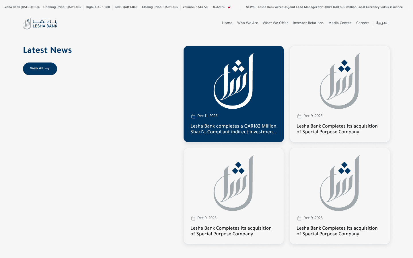
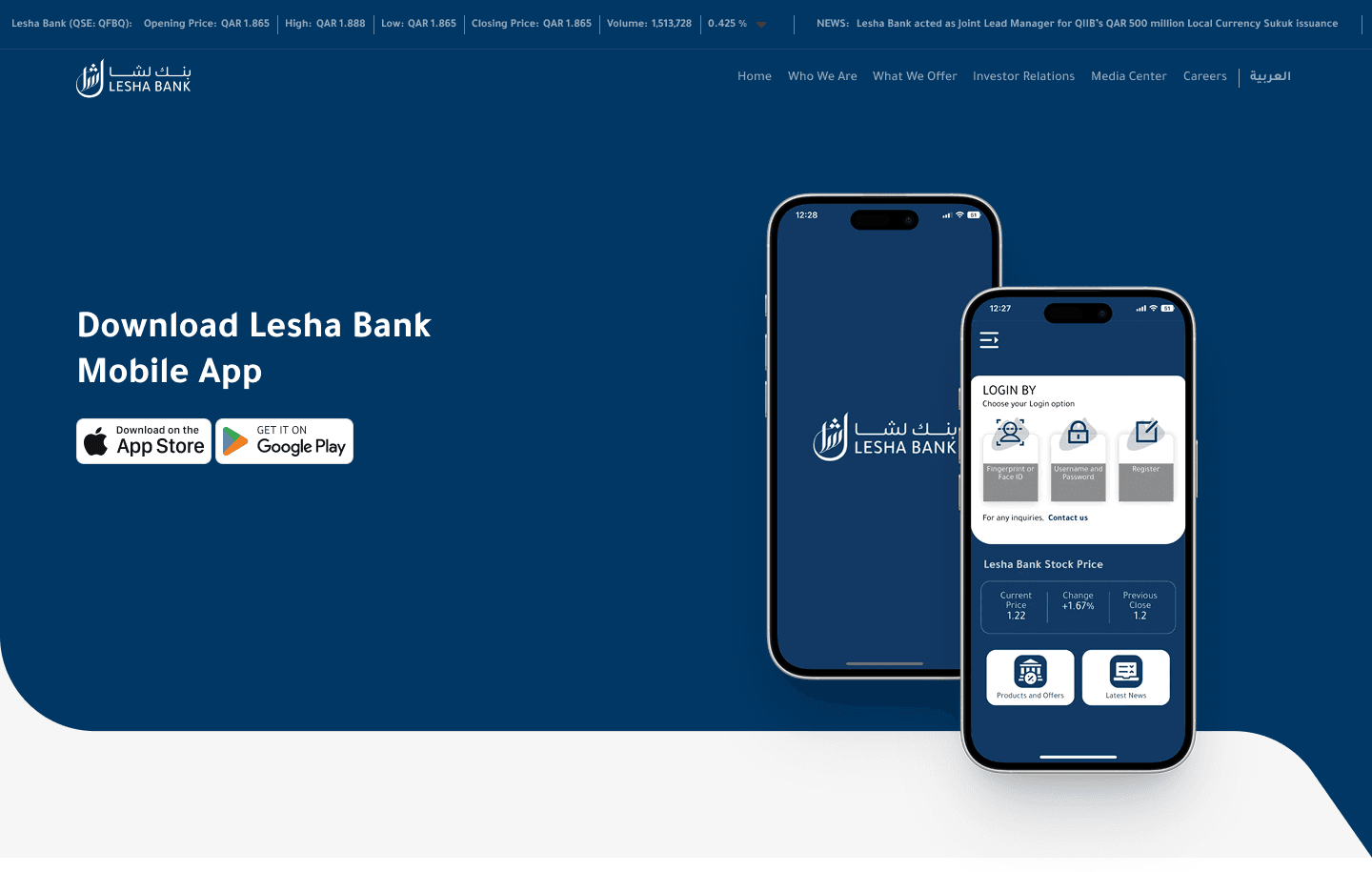
Led the bank's website redesign, aligning the digital experience with the firm's standing in the market.
Financial Services
Website Design
UI/UX Design
Know More
Lesha Bank's standing in the market was ahead of how it read online. Institutional and individual visitors assess a bank before they engage, so first impressions carry real weight. The redesign had to close the gap between reputation and digital presence.
I structured the experience so credibility and offerings surface fast. Visitors should reach what they need quickly, then go deeper without losing their place. That is how a serious institution should read.
Structure and hierarchy were the main tools, with the visual language kept disciplined. The goal was confidence conveyed through clarity.

The Hard Part
A bank's site has to satisfy very different visitors with one structure. Offerings, philosophy, and credibility all compete for the same prime space. Without a clear hierarchy, the important things get lost in the merely present.
Depth risked reading as density, and key trust signals risked being buried. The experience had to stay composed under that pressure.
What I Did
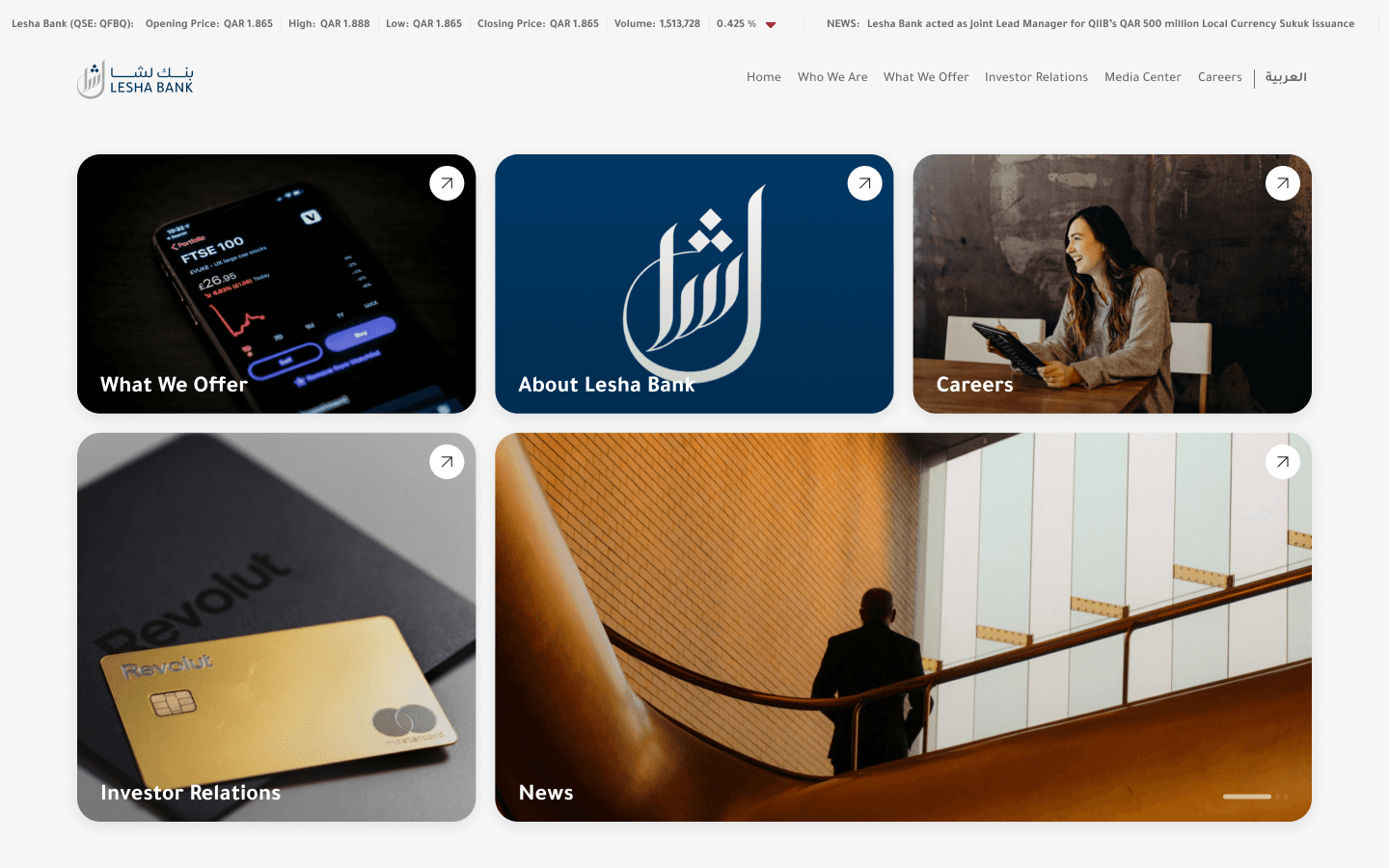
I brought offerings, philosophy, and credibility to the front, then sequenced the detail beneath them. Navigation was reshaped around how people actually evaluate a bank. Layouts were standardised for predictability and calm.
Nothing essential was cut; it was ordered. People can move from headline to detail without losing context.
What Changed
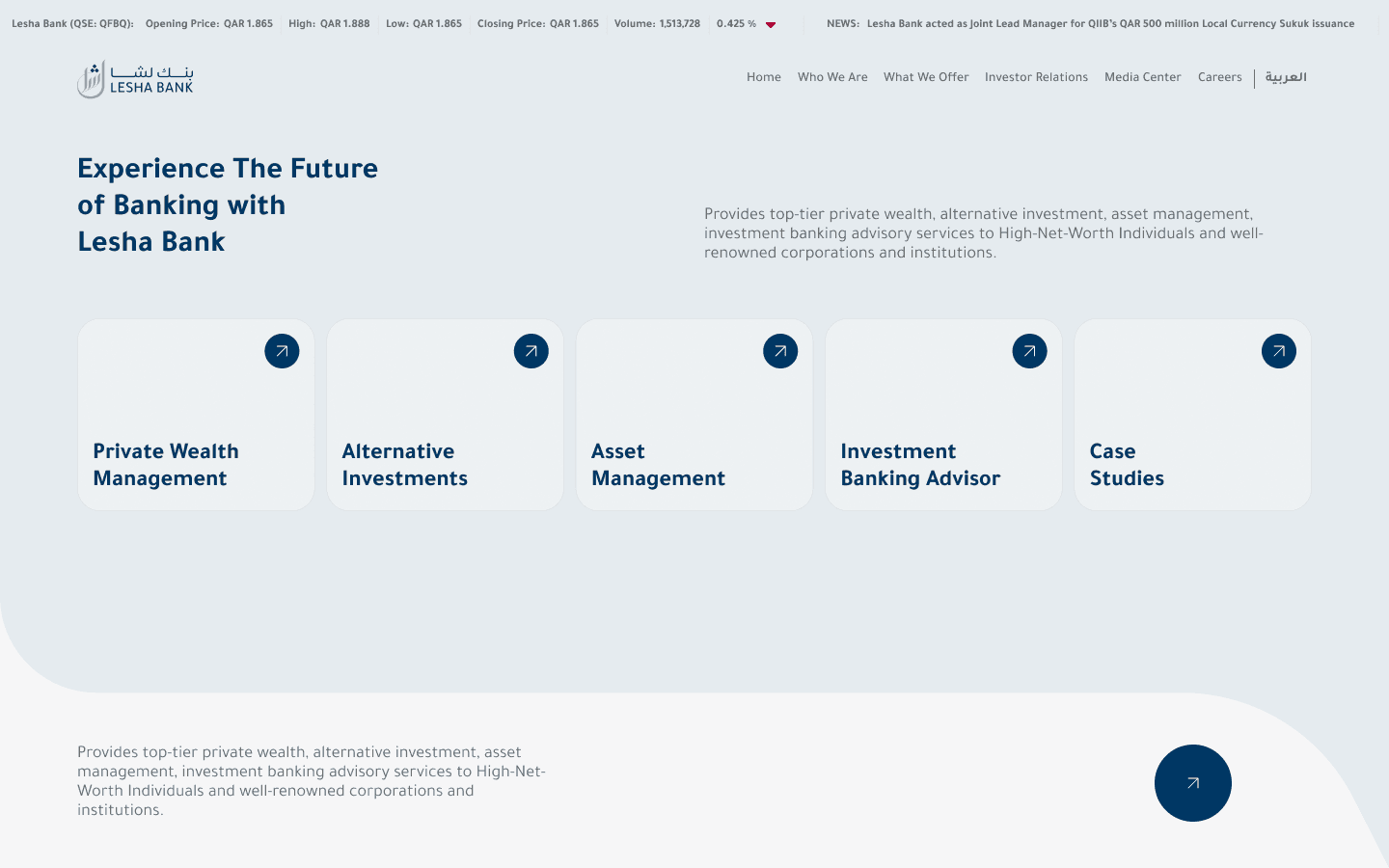
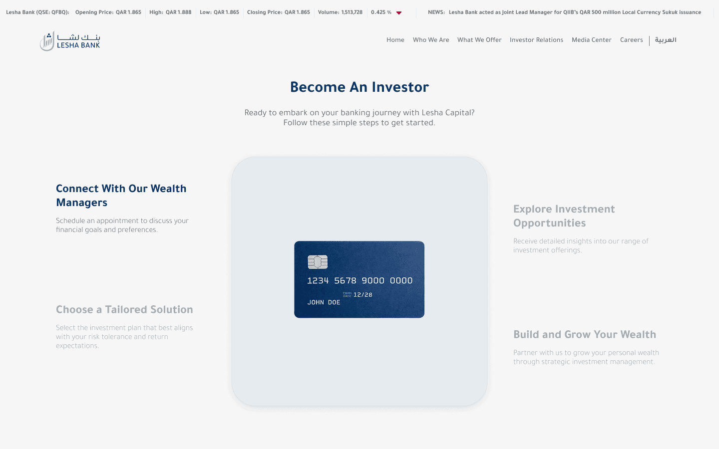
The experience now matches the firm's standing rather than lagging behind it. People reach depth without friction or dead ends. The redesign repositioned the bank digitally to sit where it already sits in the market.
Clarity and structure do the work that volume would have undermined. The site finally keeps pace with the institution.
The Call
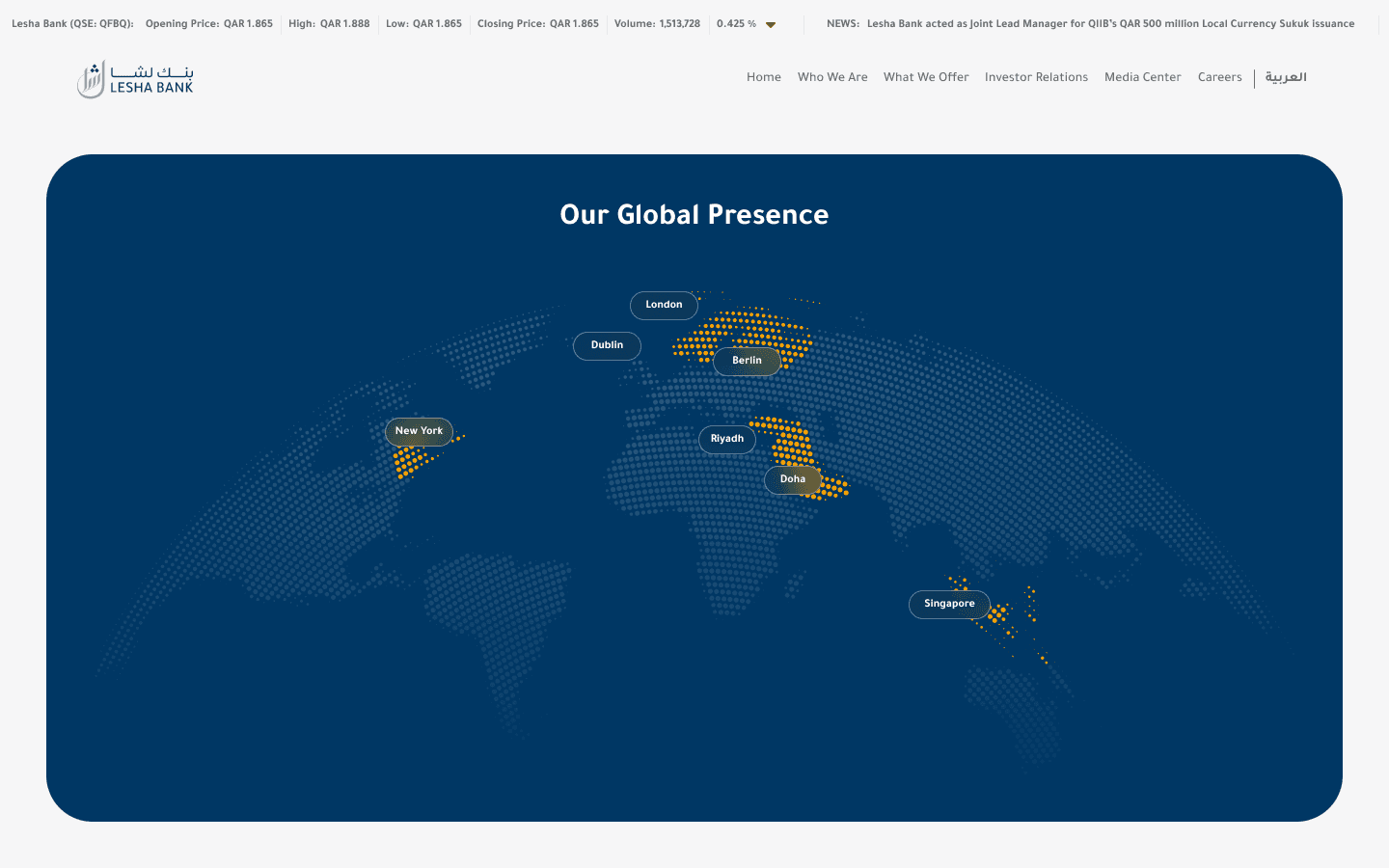
The easy route was to make the site look more impressive with richer visuals. I judged that for a bank, legibility and order signal more trust than polish does. So the work prioritized structure over spectacle.
Restraint is harder to sell as visible effort. It is what an institutional audience actually rewards.
More Works


FAQ
01
Are you available?
02
Full-time, freelance, or both?
03
What kind of work do you take?
04
Remote, on-site, or both?
05
Bilingual?
06
What do I need to get started?
07
What about unpublished or NDA work?
08
How long does an engagement take?
2026
Lesha Bank
Led the bank's website redesign, aligning the digital experience with the firm's standing in the market.
Financial Services
Website Design
UI/UX Design
Know More
Lesha Bank's standing in the market was ahead of how it read online. Institutional and individual visitors assess a bank before they engage, so first impressions carry real weight. The redesign had to close the gap between reputation and digital presence.
I structured the experience so credibility and offerings surface fast. Visitors should reach what they need quickly, then go deeper without losing their place. That is how a serious institution should read.
Structure and hierarchy were the main tools, with the visual language kept disciplined. The goal was confidence conveyed through clarity.
The Hard Part
A bank's site has to satisfy very different visitors with one structure. Offerings, philosophy, and credibility all compete for the same prime space. Without a clear hierarchy, the important things get lost in the merely present.
Depth risked reading as density, and key trust signals risked being buried. The experience had to stay composed under that pressure.
What I Did
I brought offerings, philosophy, and credibility to the front, then sequenced the detail beneath them. Navigation was reshaped around how people actually evaluate a bank. Layouts were standardised for predictability and calm.
Nothing essential was cut; it was ordered. People can move from headline to detail without losing context.
What Changed
The experience now matches the firm's standing rather than lagging behind it. People reach depth without friction or dead ends. The redesign repositioned the bank digitally to sit where it already sits in the market.
Clarity and structure do the work that volume would have undermined. The site finally keeps pace with the institution.
The Call
The easy route was to make the site look more impressive with richer visuals. I judged that for a bank, legibility and order signal more trust than polish does. So the work prioritized structure over spectacle.
Restraint is harder to sell as visible effort. It is what an institutional audience actually rewards.
More Works
FAQ
01
Are you available?
02
Full-time, freelance, or both?
03
What kind of work do you take?
04
Remote, on-site, or both?
05
Bilingual?
06
What do I need to get started?
07
What about unpublished or NDA work?
08
How long does an engagement take?
2026
Lesha Bank
Led the bank's website redesign, aligning the digital experience with the firm's standing in the market.
Financial Services
Website Design
UI/UX Design
Know More
Lesha Bank's standing in the market was ahead of how it read online. Institutional and individual visitors assess a bank before they engage, so first impressions carry real weight. The redesign had to close the gap between reputation and digital presence.
I structured the experience so credibility and offerings surface fast. Visitors should reach what they need quickly, then go deeper without losing their place. That is how a serious institution should read.
Structure and hierarchy were the main tools, with the visual language kept disciplined. The goal was confidence conveyed through clarity.
The Hard Part
A bank's site has to satisfy very different visitors with one structure. Offerings, philosophy, and credibility all compete for the same prime space. Without a clear hierarchy, the important things get lost in the merely present.
Depth risked reading as density, and key trust signals risked being buried. The experience had to stay composed under that pressure.
What I Did
I brought offerings, philosophy, and credibility to the front, then sequenced the detail beneath them. Navigation was reshaped around how people actually evaluate a bank. Layouts were standardised for predictability and calm.
Nothing essential was cut; it was ordered. People can move from headline to detail without losing context.
What Changed
The experience now matches the firm's standing rather than lagging behind it. People reach depth without friction or dead ends. The redesign repositioned the bank digitally to sit where it already sits in the market.
Clarity and structure do the work that volume would have undermined. The site finally keeps pace with the institution.
The Call
The easy route was to make the site look more impressive with richer visuals. I judged that for a bank, legibility and order signal more trust than polish does. So the work prioritized structure over spectacle.
Restraint is harder to sell as visible effort. It is what an institutional audience actually rewards.
More Works
FAQ
Are you available?
Full-time, freelance, or both?
What kind of work do you take?
Remote, on-site, or both?
Bilingual?
What do I need to get started?
What about unpublished or NDA work?
How long does an engagement take?