
2024
SafeSpace Website
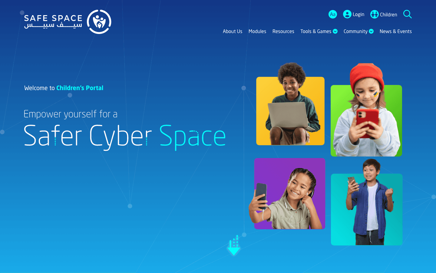
Led a focused enhancement of the existing site, improving clarity and usability without a full rebuild.
Cyber Safety & Public Awareness
Website Design
UI/UX Design
Know More
SafeSpace's website already existed and already worked. The job was to strengthen it, not start over. In a domain where people are uncertain and sometimes frightened, small friction has an outsized cost.
This called for refinement rather than reinvention. The aim was to clarify the pathways and lower the effort while keeping the trust the platform had already built. I worked with what users already knew rather than resetting it.
Navigation, hierarchy, and content flow were the levers. The platform's identity stayed intact throughout.
The Hard Part
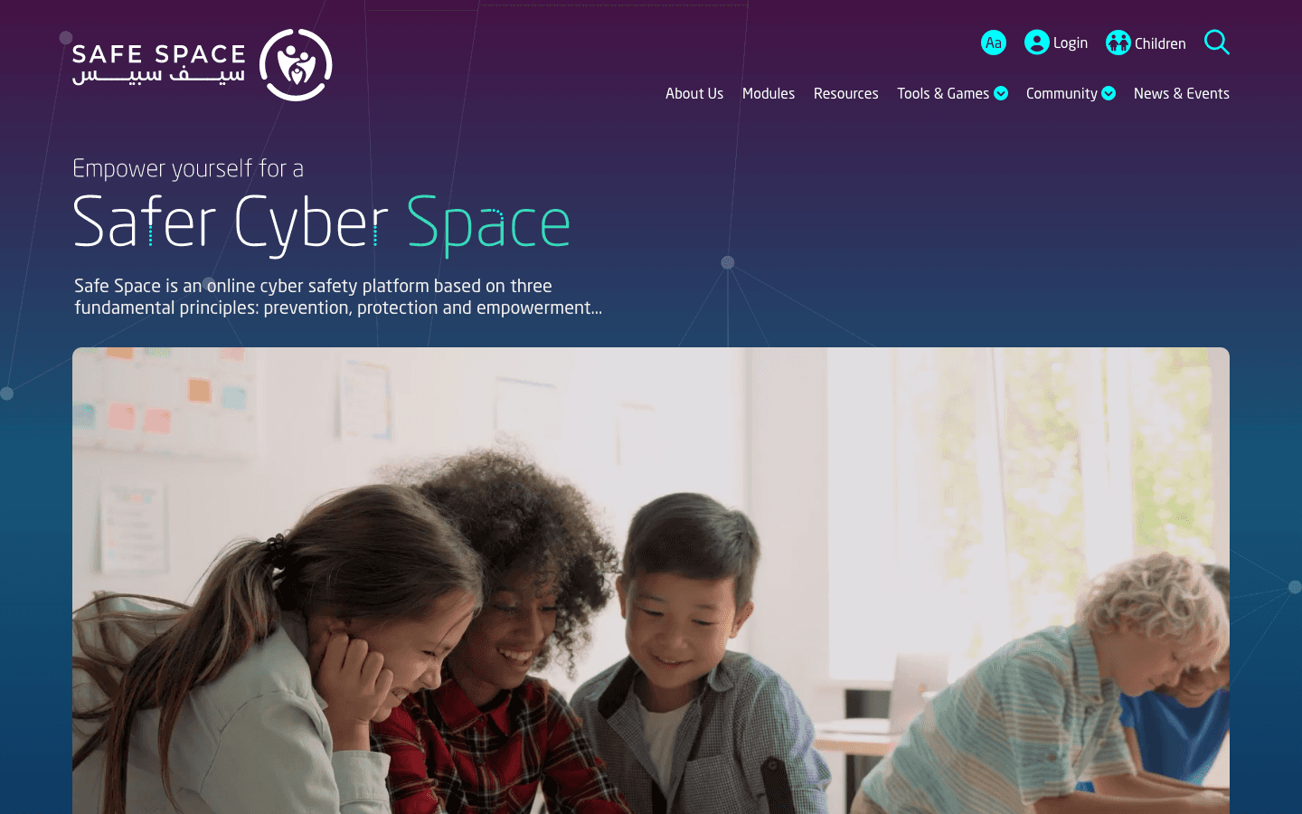
There was so much content that people struggled to know where to begin. Navigation did not always match what they were after, and priority resources were not surfaced early. The experience relied on reading instead of guiding.
Layouts varied enough to slow orientation, which pushed cognitive load up. In a sensitive domain, that hesitation costs trust.
What I Did
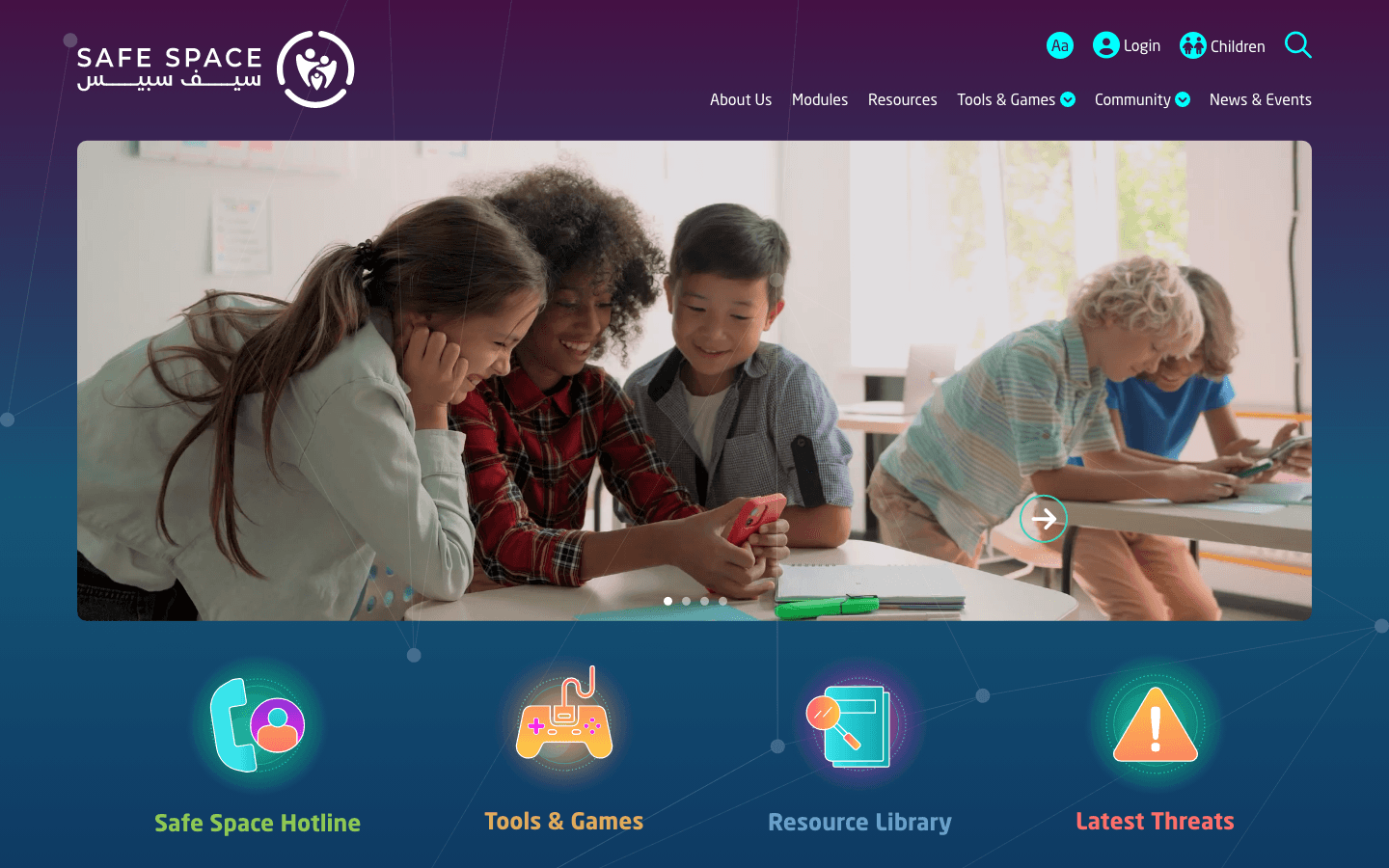
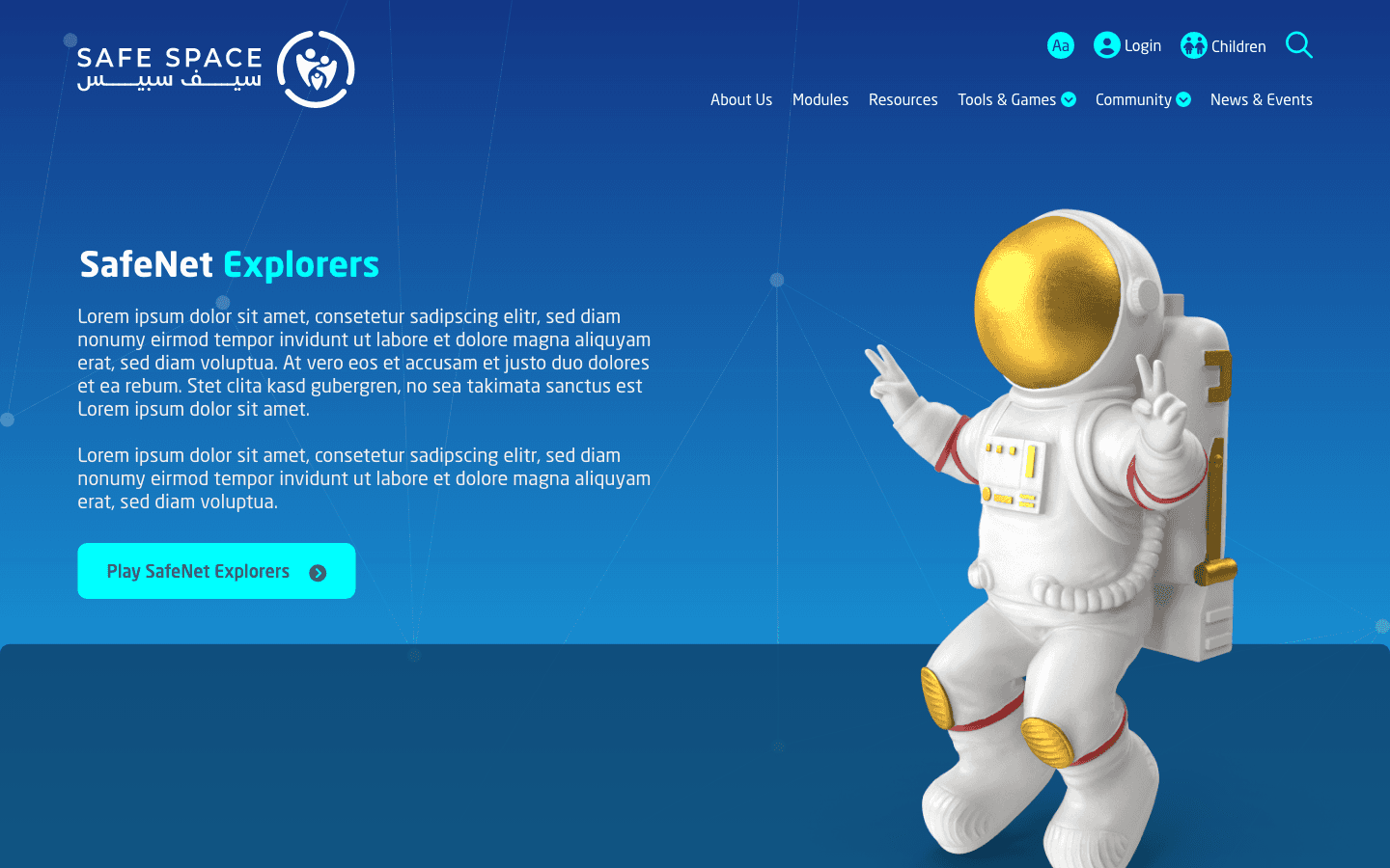
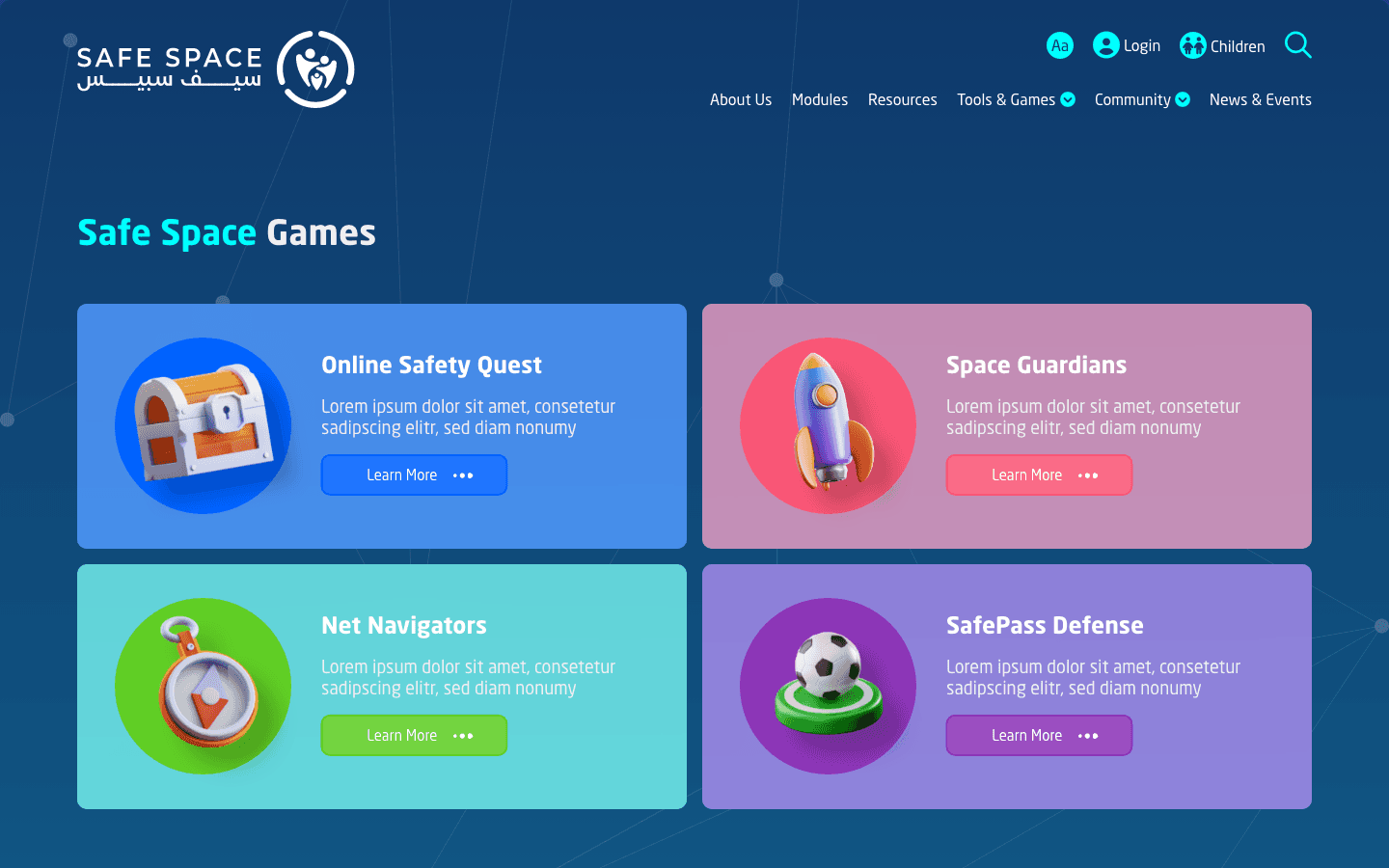
I tuned navigation to the most common needs and strengthened the hierarchy so priority resources come up sooner. Page structures were made more consistent, and the visual rhythm was adjusted for scanning. Nothing users relied on was moved out from under them.
Each change was small on its own, and together they made the experience calmer and more supportive. The familiar stayed familiar.
What Changed
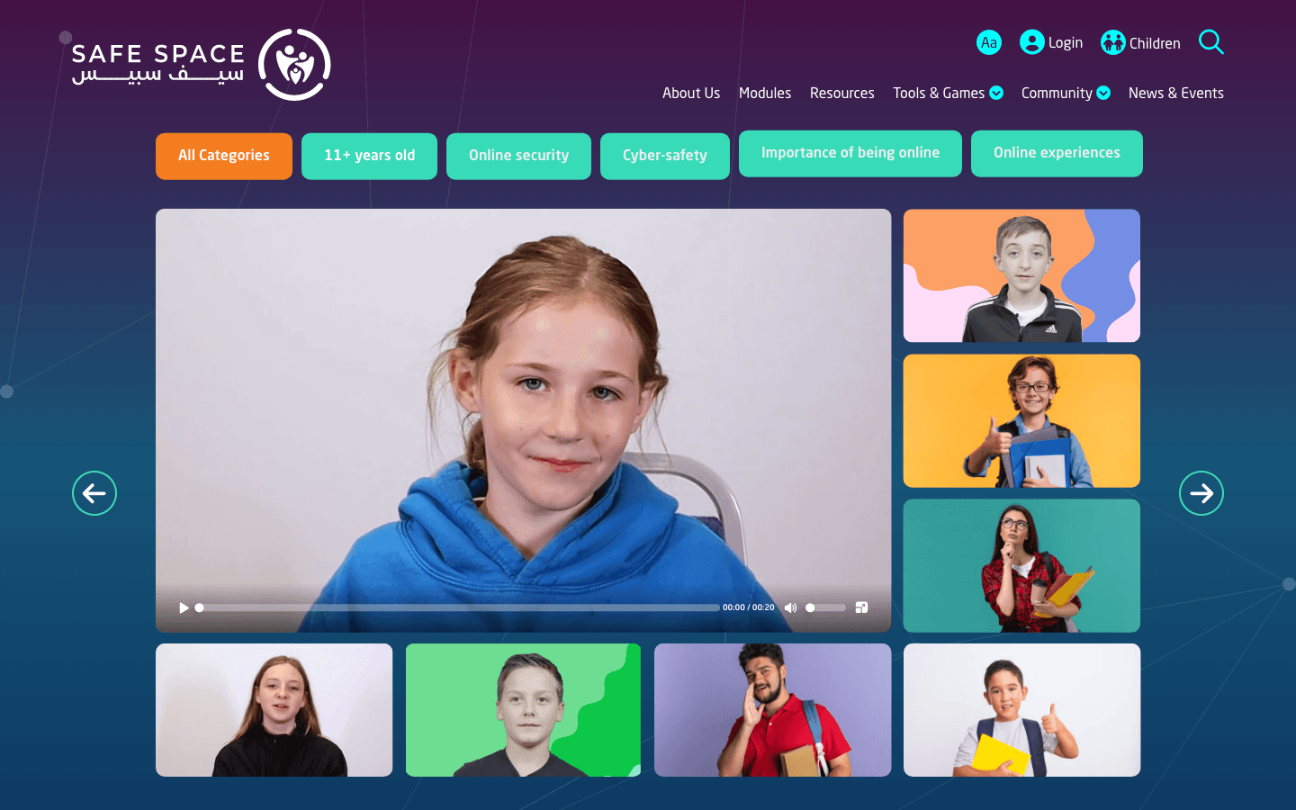
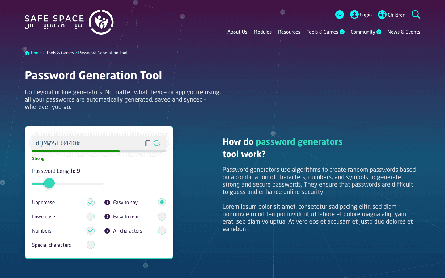
People now find guidance without first having to learn the site. The identity it had built up was reinforced, not replaced. Small structural fixes moved confidence a long way.
Careful refinement outperformed a rebuild here. The trust that already existed was protected rather than reset.
The Call
The easy pitch would have been a full redesign, which looks more impressive and bills better. The site did not need that, and a rebuild would have thrown away hardwon familiarity. I argued for the smaller, sharper intervention.
Knowing when not to redesign is its own discipline. Restraint served the users better than ambition would have.
More Works

FAQ
01
Are you available?
02
Full-time, freelance, or both?
03
What kind of work do you take?
04
Remote, on-site, or both?
05
Bilingual?
06
What do I need to get started?
07
What about unpublished or NDA work?
08
How long does an engagement take?
2024
SafeSpace Website
Led a focused enhancement of the existing site, improving clarity and usability without a full rebuild.
Cyber Safety & Public Awareness
Website Design
UI/UX Design
Know More
SafeSpace's website already existed and already worked. The job was to strengthen it, not start over. In a domain where people are uncertain and sometimes frightened, small friction has an outsized cost.
This called for refinement rather than reinvention. The aim was to clarify the pathways and lower the effort while keeping the trust the platform had already built. I worked with what users already knew rather than resetting it.
Navigation, hierarchy, and content flow were the levers. The platform's identity stayed intact throughout.
The Hard Part
There was so much content that people struggled to know where to begin. Navigation did not always match what they were after, and priority resources were not surfaced early. The experience relied on reading instead of guiding.
Layouts varied enough to slow orientation, which pushed cognitive load up. In a sensitive domain, that hesitation costs trust.
What I Did
I tuned navigation to the most common needs and strengthened the hierarchy so priority resources come up sooner. Page structures were made more consistent, and the visual rhythm was adjusted for scanning. Nothing users relied on was moved out from under them.
Each change was small on its own, and together they made the experience calmer and more supportive. The familiar stayed familiar.
What Changed
People now find guidance without first having to learn the site. The identity it had built up was reinforced, not replaced. Small structural fixes moved confidence a long way.
Careful refinement outperformed a rebuild here. The trust that already existed was protected rather than reset.
The Call
The easy pitch would have been a full redesign, which looks more impressive and bills better. The site did not need that, and a rebuild would have thrown away hardwon familiarity. I argued for the smaller, sharper intervention.
Knowing when not to redesign is its own discipline. Restraint served the users better than ambition would have.
More Works
FAQ
01
Are you available?
02
Full-time, freelance, or both?
03
What kind of work do you take?
04
Remote, on-site, or both?
05
Bilingual?
06
What do I need to get started?
07
What about unpublished or NDA work?
08
How long does an engagement take?
2024
SafeSpace Website
Led a focused enhancement of the existing site, improving clarity and usability without a full rebuild.
Cyber Safety & Public Awareness
Website Design
UI/UX Design
Know More
SafeSpace's website already existed and already worked. The job was to strengthen it, not start over. In a domain where people are uncertain and sometimes frightened, small friction has an outsized cost.
This called for refinement rather than reinvention. The aim was to clarify the pathways and lower the effort while keeping the trust the platform had already built. I worked with what users already knew rather than resetting it.
Navigation, hierarchy, and content flow were the levers. The platform's identity stayed intact throughout.
The Hard Part
There was so much content that people struggled to know where to begin. Navigation did not always match what they were after, and priority resources were not surfaced early. The experience relied on reading instead of guiding.
Layouts varied enough to slow orientation, which pushed cognitive load up. In a sensitive domain, that hesitation costs trust.
What I Did
I tuned navigation to the most common needs and strengthened the hierarchy so priority resources come up sooner. Page structures were made more consistent, and the visual rhythm was adjusted for scanning. Nothing users relied on was moved out from under them.
Each change was small on its own, and together they made the experience calmer and more supportive. The familiar stayed familiar.
What Changed
People now find guidance without first having to learn the site. The identity it had built up was reinforced, not replaced. Small structural fixes moved confidence a long way.
Careful refinement outperformed a rebuild here. The trust that already existed was protected rather than reset.
The Call
The easy pitch would have been a full redesign, which looks more impressive and bills better. The site did not need that, and a rebuild would have thrown away hardwon familiarity. I argued for the smaller, sharper intervention.
Knowing when not to redesign is its own discipline. Restraint served the users better than ambition would have.
More Works
FAQ
Are you available?
Full-time, freelance, or both?
What kind of work do you take?
Remote, on-site, or both?
Bilingual?
What do I need to get started?
What about unpublished or NDA work?
How long does an engagement take?