
2024
WISH 2024
led a UX evaluation and competitive benchmark, then turned it into a prioritised roadmap. The output was a plan the team could act on, not a set of screens.
Healthcare
Website Design
UI/UX Design
Know More
The World Innovation Summit for Health is a global platform where health policy, research, and innovation meet. An international audience holds it to the standard of the best institutions in its field. The brief was not to redesign anything, but to find out, with evidence, where it was falling short.
Rather than jump to screens, I was asked to diagnose the current experience and recommend what to do about it. That made the thinking, not the visuals, the deliverable.
No screens were drawn on this engagement, and that was the point. The value sat in getting the priorities right before anyone spent budget building. A clear diagnosis is what makes a later redesign worth funding.
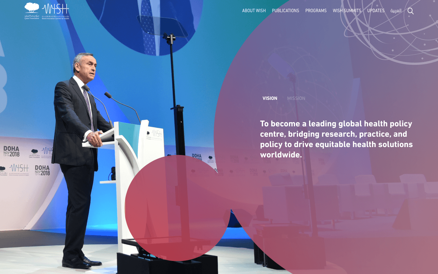
I assessed how WISH presents its value online, where the experience loses people, and how it compares to peer institutions. The result was a roadmap the team could follow and defend.
The Hard Part
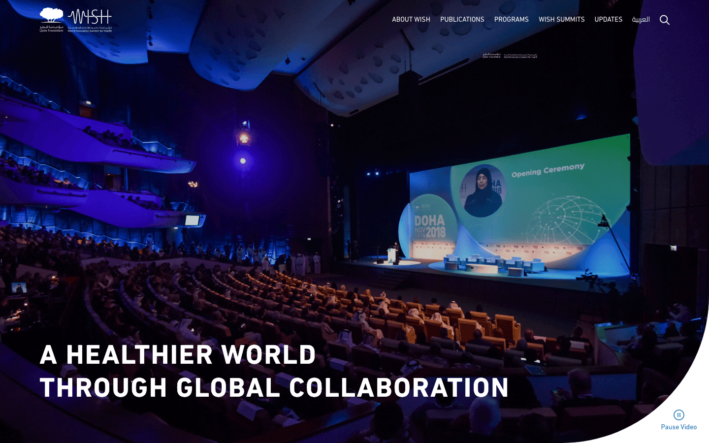
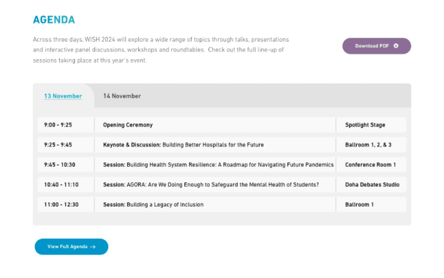
WISH does a great deal, and the site tried to surface all of it at once. Breadth had quietly become the main usability problem. The more it showed, the less any of it landed.
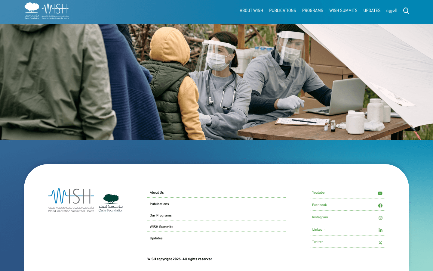
Navigation reflected how much content existed rather than what visitors came for, and major initiatives competed for the same attention. Nothing tied the mission, the research, and the impact into a single thread.
What I Did
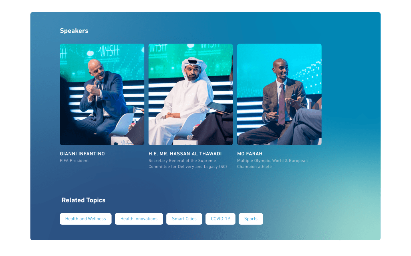
I evaluated where people drop off and benchmarked the site against comparable bodies. Each gap was then translated into a specific, ranked recommendation. The point was to hand over an order of operations, not a list of complaints.
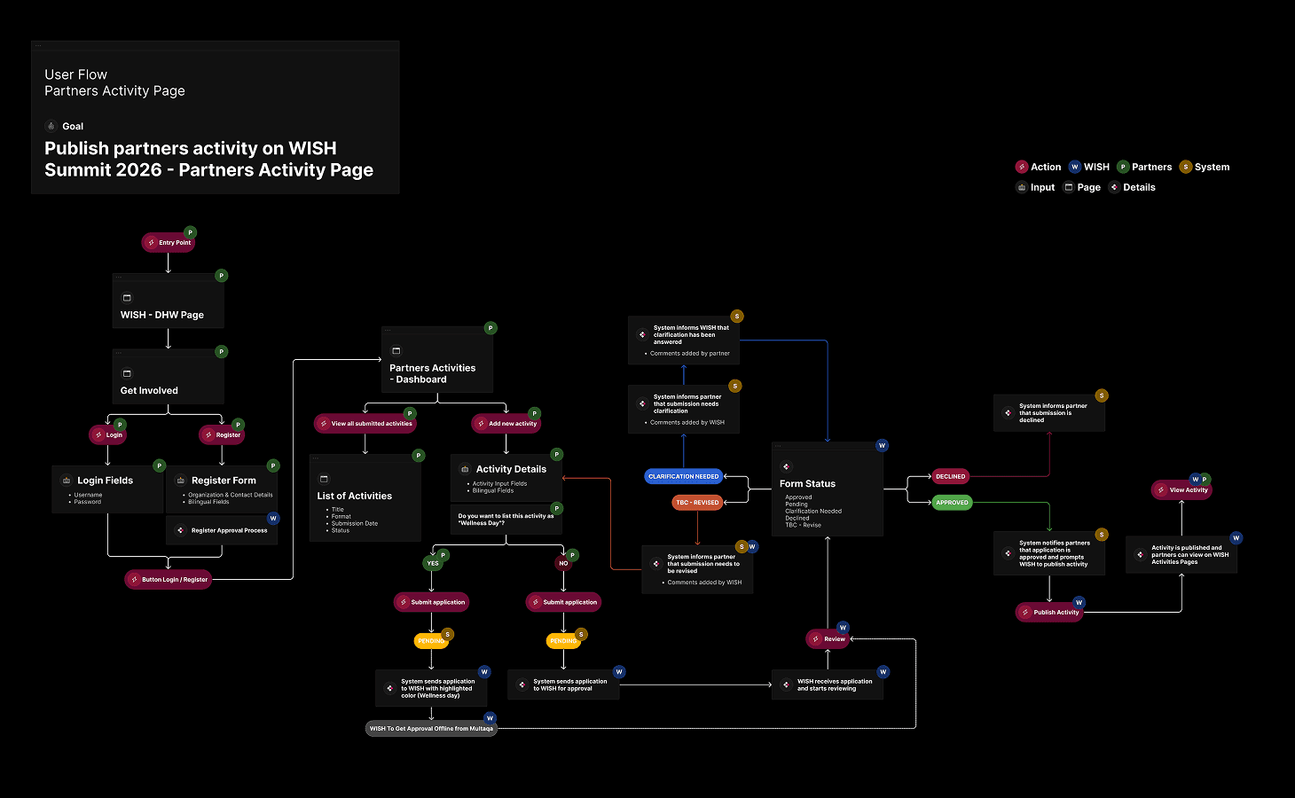
The evaluation surfaced the structural problems and the benchmark defined what good looks like at this level. The recommendations covered navigation, content strategy, and flow, in priority order.
What Changed
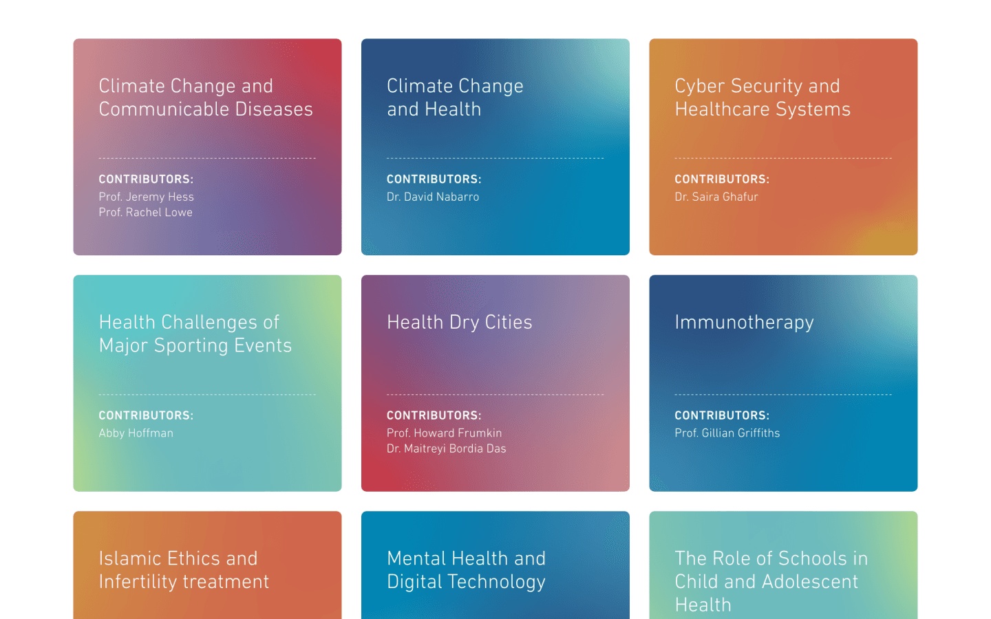
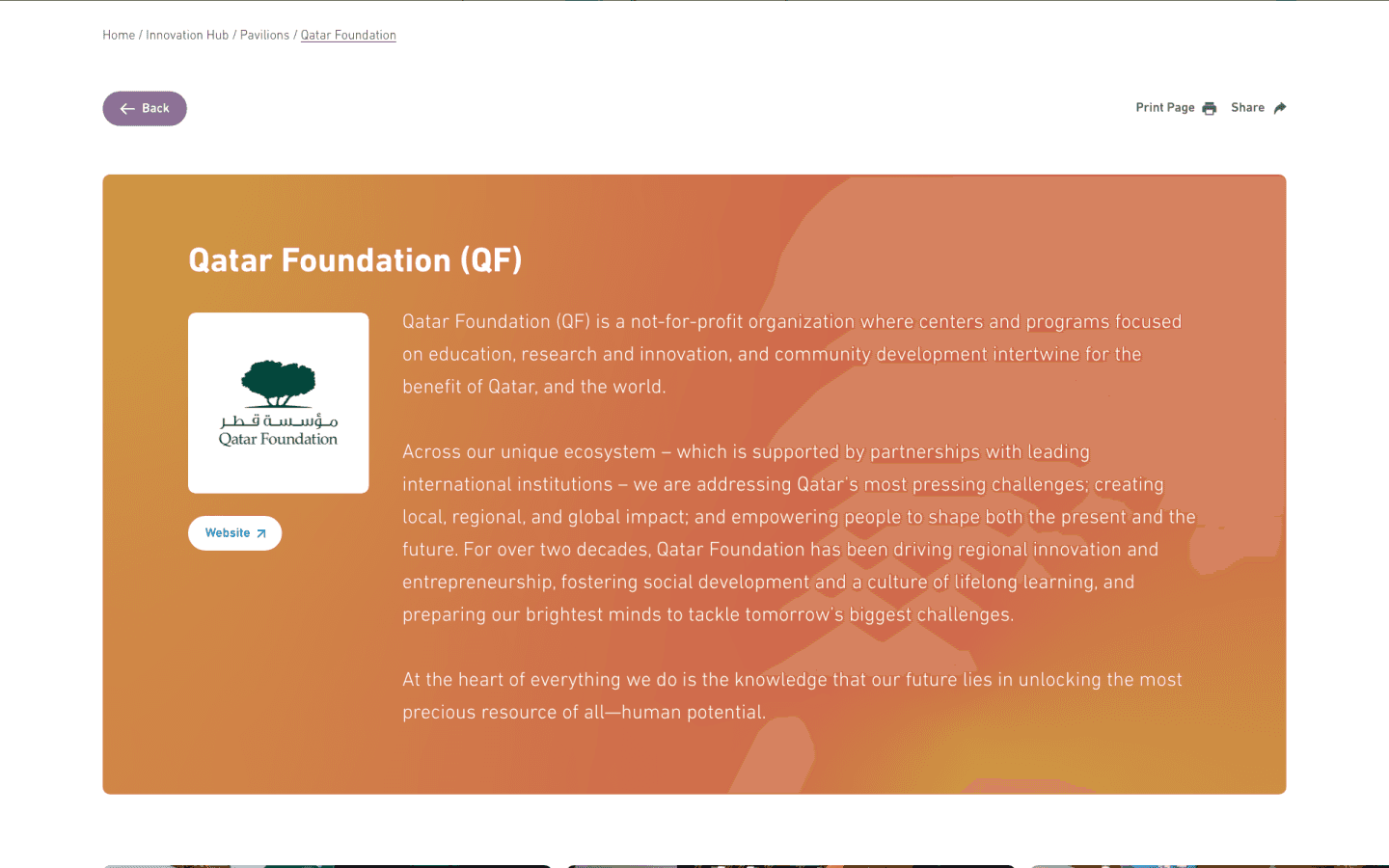
The team left with a shared map of the next eighteen months of UX work. They knew what to keep, what to retire, and what to build, and why each came in that order. It replaced a vague urge to redesign with a plan they could defend.
That clarity is worth more than another round of mockups would have been. It set up whatever redesign comes next to actually land.
The Call
The easy thing to sell a client is a redesign, because it looks like action. The honest finding was that WISH did not need new screens yet; it needed to agree on priorities. I argued for the roadmap over the rebuild.
That is the harder conversation to have, and the more useful one. Selling direction takes more trust than selling pixels.
More Works


FAQ
01
Are you available?
02
Full-time, freelance, or both?
03
What kind of work do you take?
04
Remote, on-site, or both?
05
Bilingual?
06
What do I need to get started?
07
What about unpublished or NDA work?
08
How long does an engagement take?
2024
WISH 2024
led a UX evaluation and competitive benchmark, then turned it into a prioritised roadmap. The output was a plan the team could act on, not a set of screens.
Healthcare
Website Design
UI/UX Design
Know More
The World Innovation Summit for Health is a global platform where health policy, research, and innovation meet. An international audience holds it to the standard of the best institutions in its field. The brief was not to redesign anything, but to find out, with evidence, where it was falling short.
Rather than jump to screens, I was asked to diagnose the current experience and recommend what to do about it. That made the thinking, not the visuals, the deliverable.
No screens were drawn on this engagement, and that was the point. The value sat in getting the priorities right before anyone spent budget building. A clear diagnosis is what makes a later redesign worth funding.
I assessed how WISH presents its value online, where the experience loses people, and how it compares to peer institutions. The result was a roadmap the team could follow and defend.
The Hard Part
WISH does a great deal, and the site tried to surface all of it at once. Breadth had quietly become the main usability problem. The more it showed, the less any of it landed.
Navigation reflected how much content existed rather than what visitors came for, and major initiatives competed for the same attention. Nothing tied the mission, the research, and the impact into a single thread.
What I Did
I evaluated where people drop off and benchmarked the site against comparable bodies. Each gap was then translated into a specific, ranked recommendation. The point was to hand over an order of operations, not a list of complaints.
The evaluation surfaced the structural problems and the benchmark defined what good looks like at this level. The recommendations covered navigation, content strategy, and flow, in priority order.
What Changed
The team left with a shared map of the next eighteen months of UX work. They knew what to keep, what to retire, and what to build, and why each came in that order. It replaced a vague urge to redesign with a plan they could defend.
That clarity is worth more than another round of mockups would have been. It set up whatever redesign comes next to actually land.
The Call
The easy thing to sell a client is a redesign, because it looks like action. The honest finding was that WISH did not need new screens yet; it needed to agree on priorities. I argued for the roadmap over the rebuild.
That is the harder conversation to have, and the more useful one. Selling direction takes more trust than selling pixels.
More Works
FAQ
01
Are you available?
02
Full-time, freelance, or both?
03
What kind of work do you take?
04
Remote, on-site, or both?
05
Bilingual?
06
What do I need to get started?
07
What about unpublished or NDA work?
08
How long does an engagement take?
2024
WISH 2024
led a UX evaluation and competitive benchmark, then turned it into a prioritised roadmap. The output was a plan the team could act on, not a set of screens.
Healthcare
Website Design
UI/UX Design
Know More
The World Innovation Summit for Health is a global platform where health policy, research, and innovation meet. An international audience holds it to the standard of the best institutions in its field. The brief was not to redesign anything, but to find out, with evidence, where it was falling short.
Rather than jump to screens, I was asked to diagnose the current experience and recommend what to do about it. That made the thinking, not the visuals, the deliverable.
No screens were drawn on this engagement, and that was the point. The value sat in getting the priorities right before anyone spent budget building. A clear diagnosis is what makes a later redesign worth funding.
I assessed how WISH presents its value online, where the experience loses people, and how it compares to peer institutions. The result was a roadmap the team could follow and defend.
The Hard Part
WISH does a great deal, and the site tried to surface all of it at once. Breadth had quietly become the main usability problem. The more it showed, the less any of it landed.
Navigation reflected how much content existed rather than what visitors came for, and major initiatives competed for the same attention. Nothing tied the mission, the research, and the impact into a single thread.
What I Did
I evaluated where people drop off and benchmarked the site against comparable bodies. Each gap was then translated into a specific, ranked recommendation. The point was to hand over an order of operations, not a list of complaints.
The evaluation surfaced the structural problems and the benchmark defined what good looks like at this level. The recommendations covered navigation, content strategy, and flow, in priority order.
What Changed
The team left with a shared map of the next eighteen months of UX work. They knew what to keep, what to retire, and what to build, and why each came in that order. It replaced a vague urge to redesign with a plan they could defend.
That clarity is worth more than another round of mockups would have been. It set up whatever redesign comes next to actually land.
The Call
The easy thing to sell a client is a redesign, because it looks like action. The honest finding was that WISH did not need new screens yet; it needed to agree on priorities. I argued for the roadmap over the rebuild.
That is the harder conversation to have, and the more useful one. Selling direction takes more trust than selling pixels.
More Works
FAQ
Are you available?
Full-time, freelance, or both?
What kind of work do you take?
Remote, on-site, or both?
Bilingual?
What do I need to get started?
What about unpublished or NDA work?
How long does an engagement take?